Residência em Ordem
Brand, brand book and website for a law firm in Setúbal that handles immigration, residency and Portuguese citizenship.

Project
overview
A Residência em Ordem Portugal supports people and families through regularisation in Portugal: residency, citizenship and family reunification. The project covered the whole brand, from the symbol to the brand book and the company website.
The challenge
Immigration brands almost always talk about the destination: the passport, the flag, the stamp. People looking for this service need something else along the way: knowing which stage they are at, which documents are missing and how long it takes. The brand had to convey order and legal rigour without feeling cold.
The solution
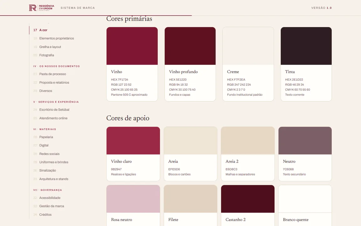
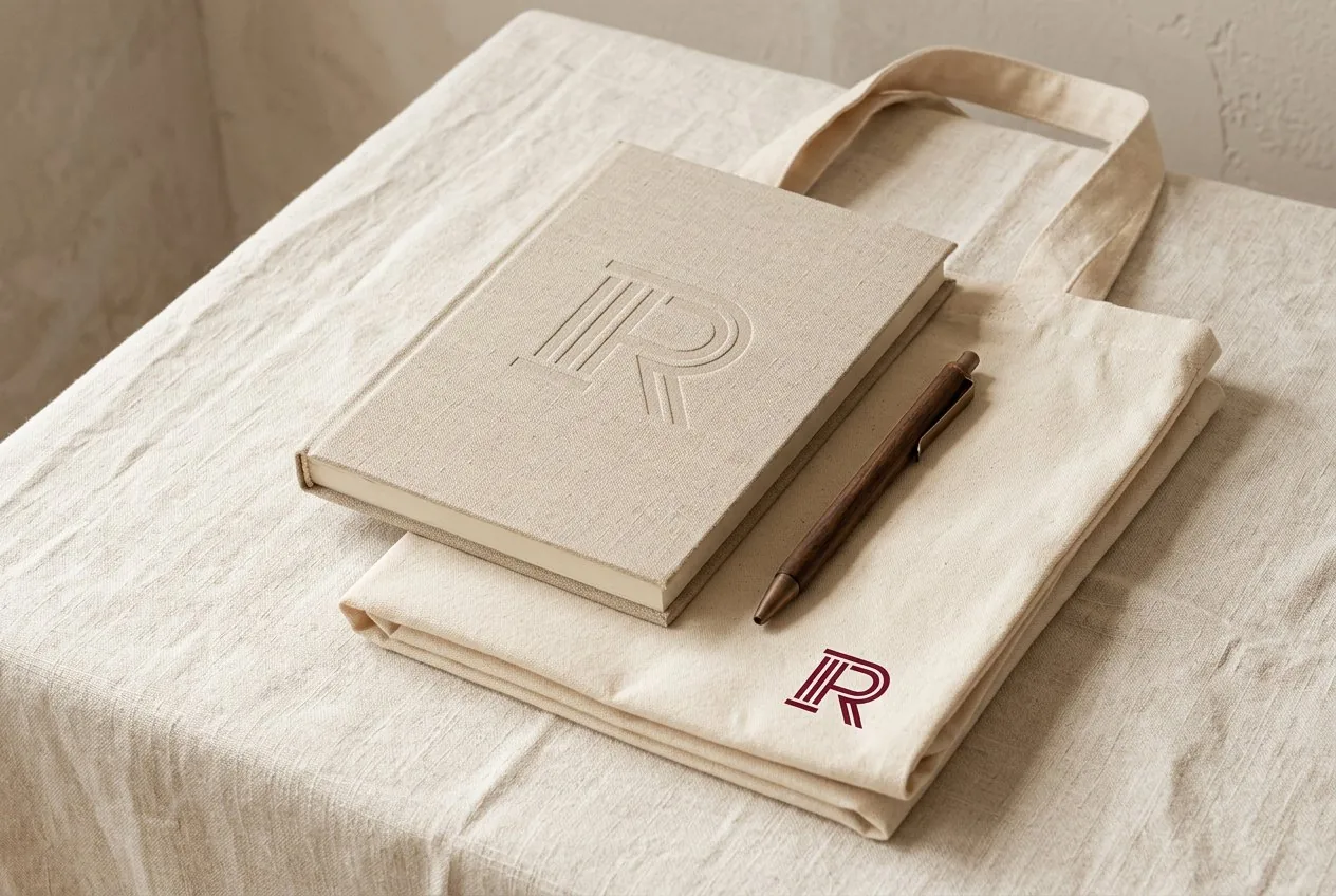
A symbol made of three parallel lines, recalling the fluting of a column and the ruled lines of a document. Around it, a complete system with a wine and cream palette, Newsreader and Archivo, photography rules and applications from stationery to signage, gathered in a 34-chapter brand book. The website follows the same system and explains the five immigration routes as a dossier that opens stage by stage.
The result
A brand recognised by its structure rather than travel clichés, a brand book that lets any partner produce consistent work, and a website that answers questions before the first conversation.
The website
in motion
A single page that takes people from the problem to the first conversation: practice areas, the five routes as a dossier, the team and the FAQ.


Scroll inside the screen to browse the website.Drag inside the screen to scroll through the website.
The system
in one place
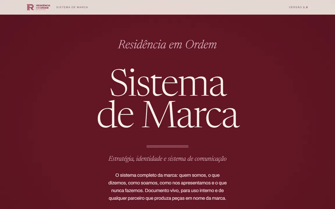
A living document, with a fixed index and reading progress: foundations, visual identity, documents, services, materials and brand management.
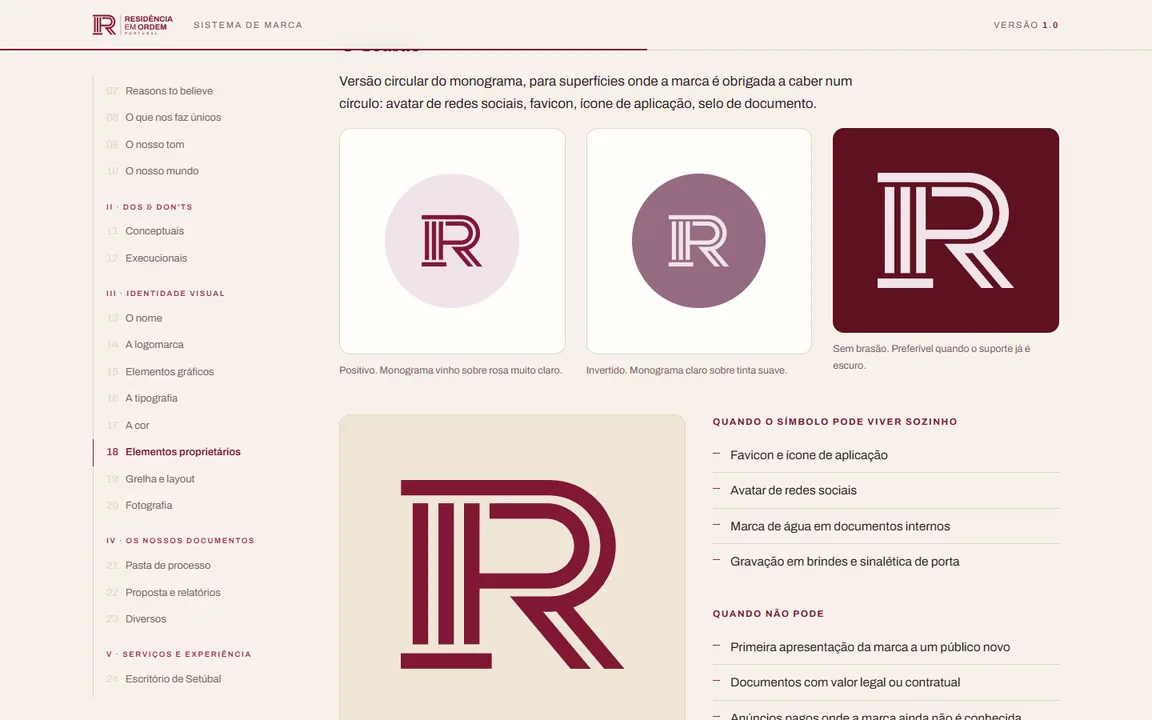
An R made
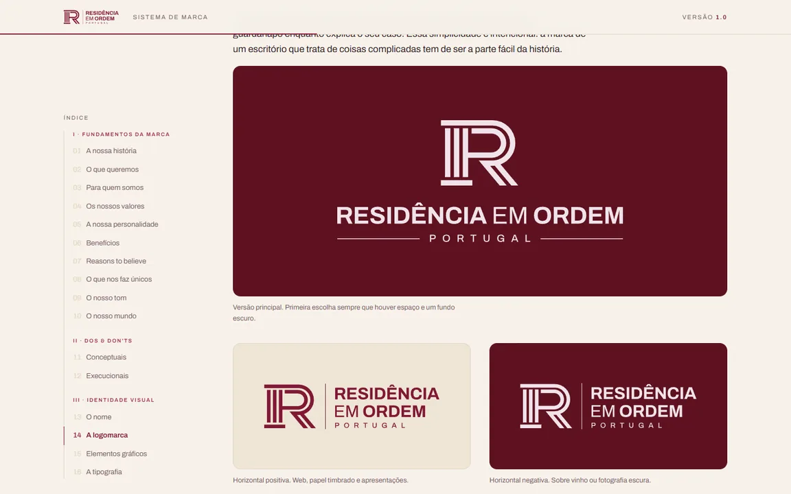
of three lines
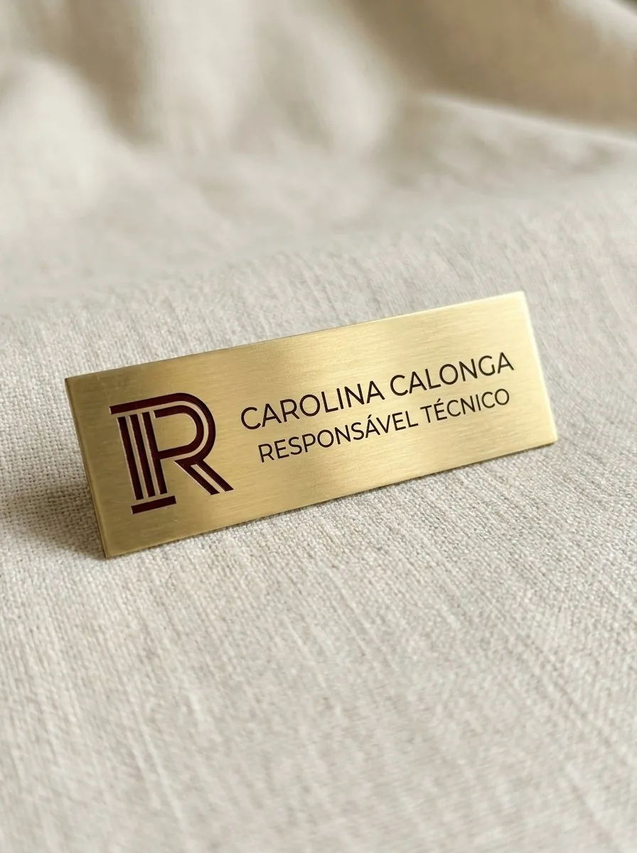
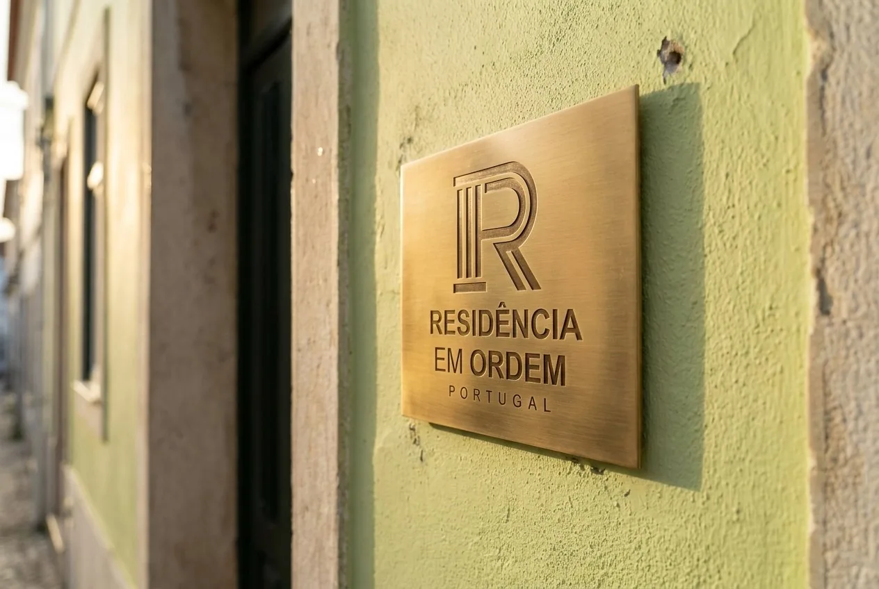
There are always three, never two or four. The symbol is the brand's most recognisable asset and signs everything, from the business card to the plaque on the door.


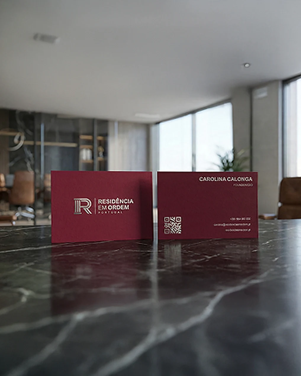
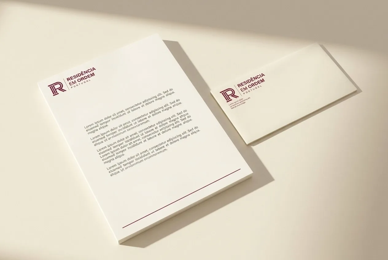
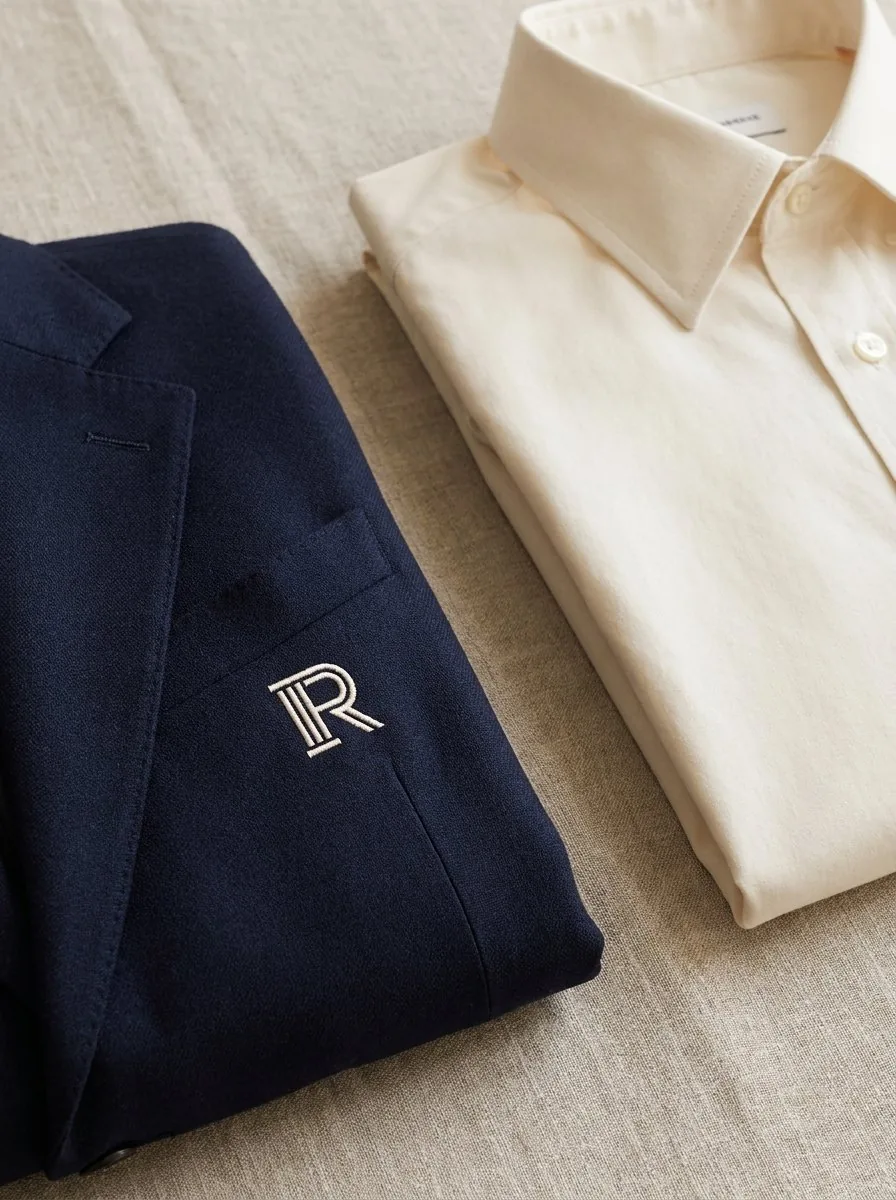
From the business card
to the façade
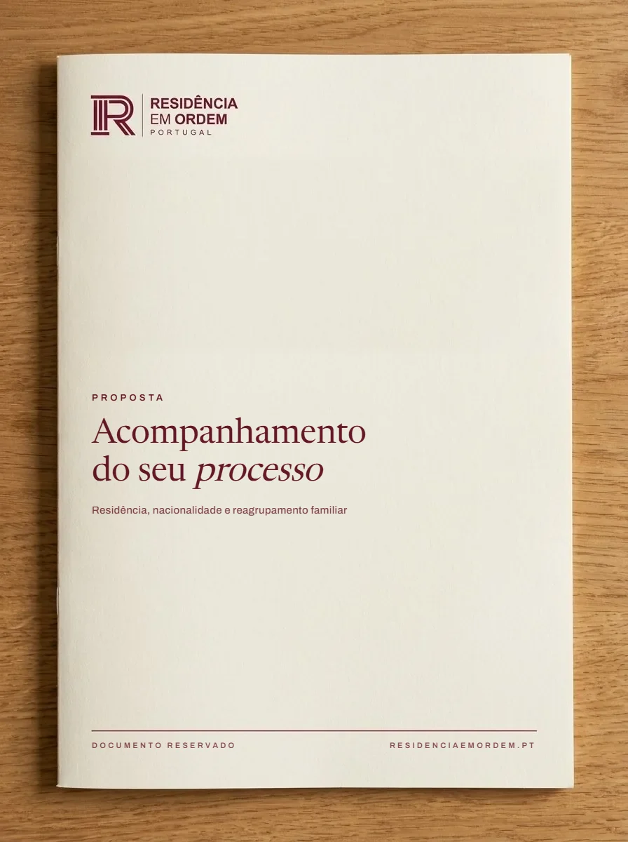
Stationery, case documents, uniforms and signage, all from the same rules.
What was
delivered
Brand, brand book and website speaking the same language, from first contact to the plaque on the door.
Have a similar project
on the table?
Thirty minutes to understand the context, the challenge and what makes sense to do next. No sales pitch.
Talk to meOther
projects
Every case follows the same structure: challenge, solution, result.