Vidrexport
Bringing the solidity of an industrial bottle maker into digital and giving it, through the product, a sensory narrative about what it means to be Portuguese.
Project
overview
Vidrexport is an industrial company specialised in producing glass bottles. The goal was to carry the brand's solidity and credibility into digital, organising the information clearly and accessibly, and strengthening its position in the market.
The challenge
Building a solid digital presence for a technical, industrial context without losing the product's emotional side. The information was dense and the brand's positioning was not coming across.
The solution
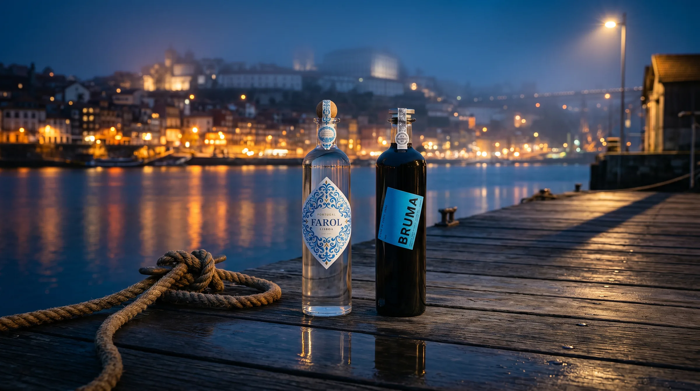
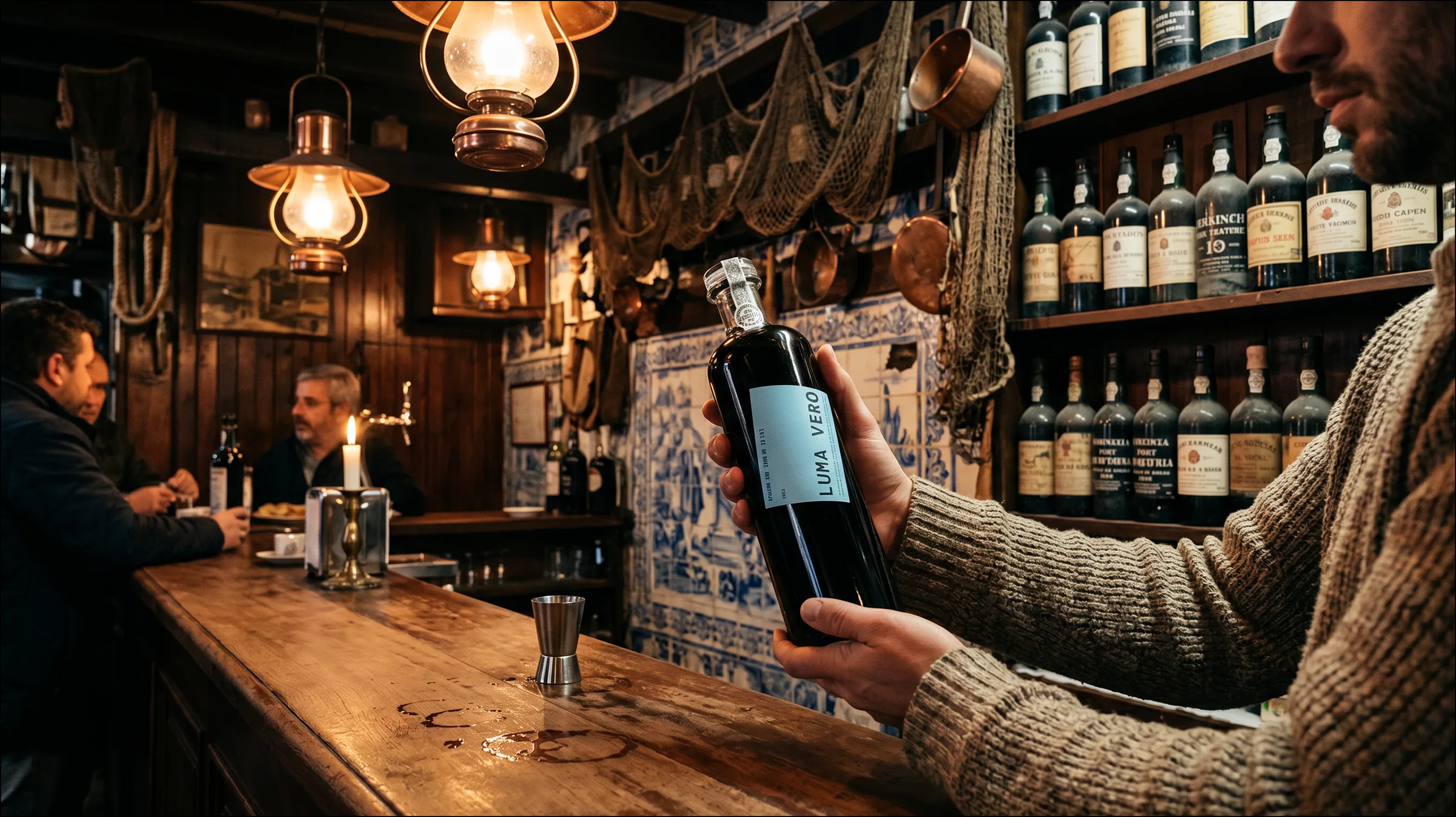
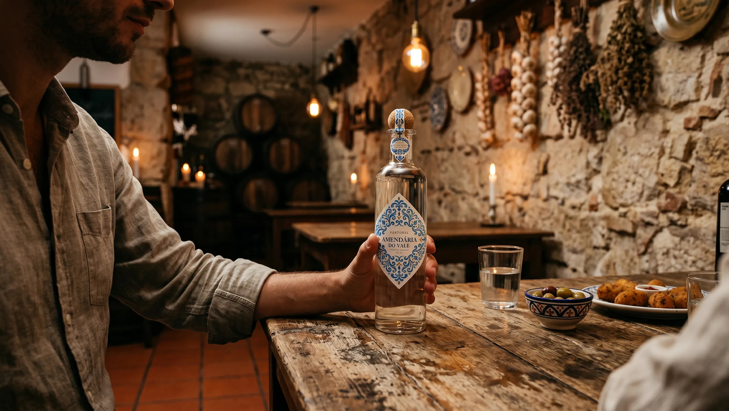
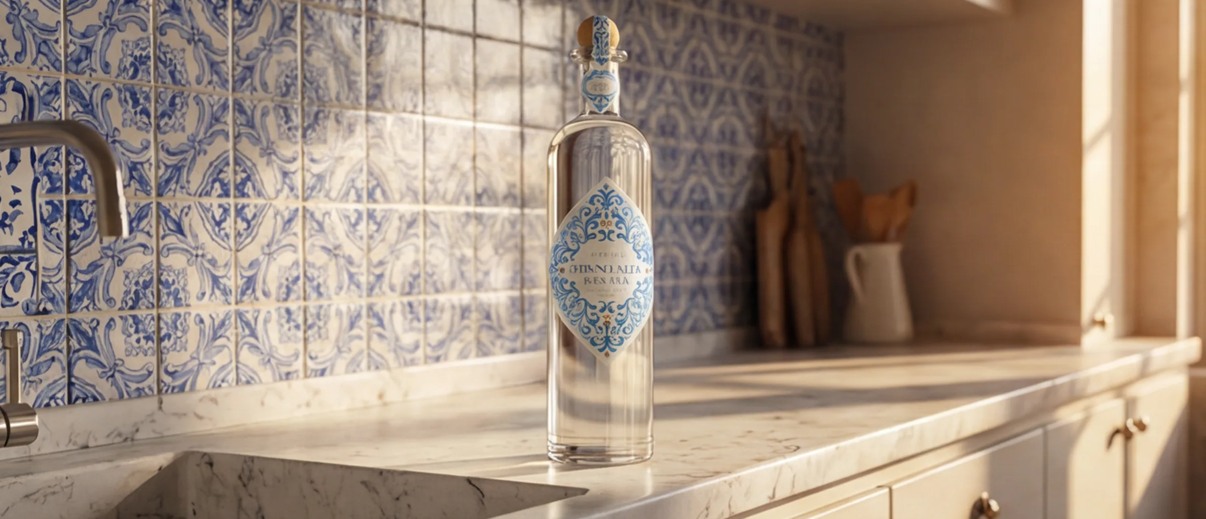
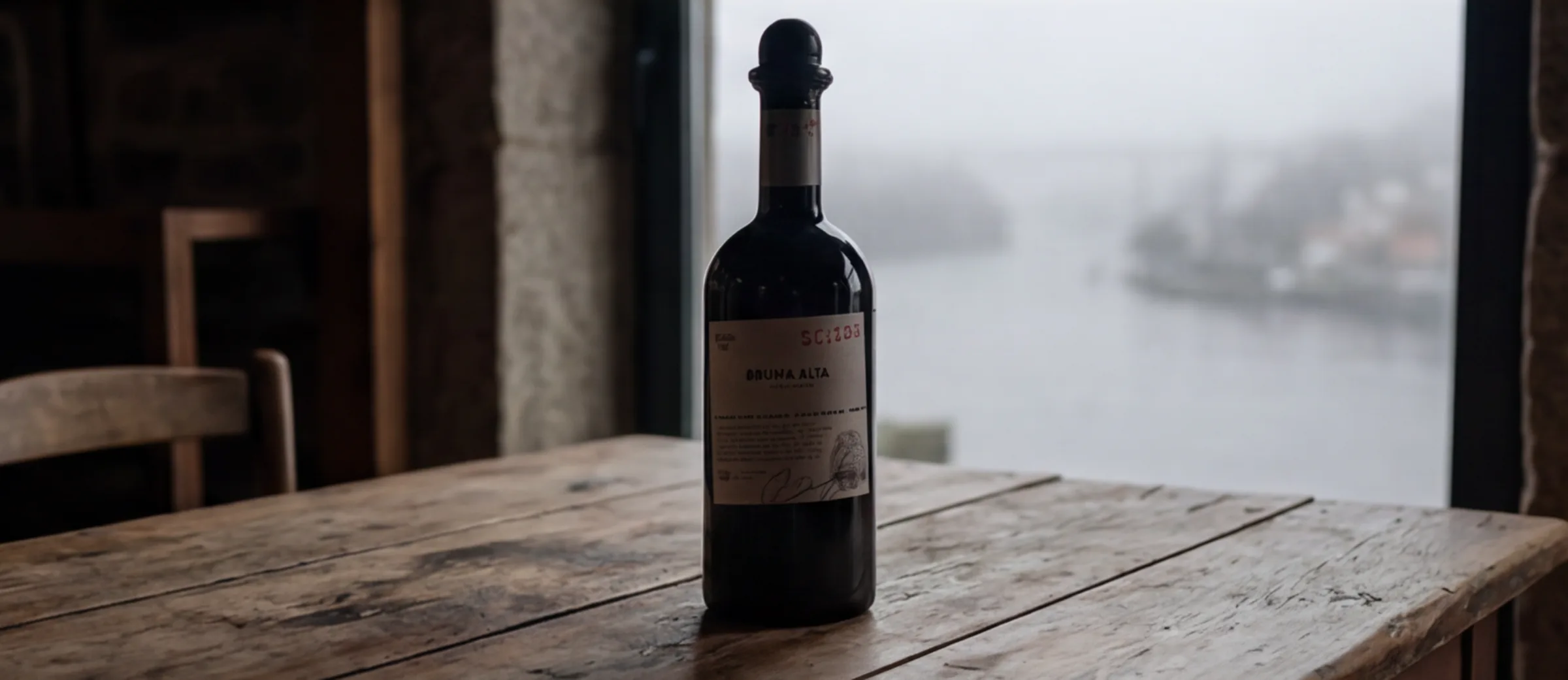
An intuitive, functional website with simple navigation and a well-defined structure. The visual side balances technical precision with identity. The brand narrative came forward through the product, in a sensory approach: a collection that translates Portuguese character into form. Between lighthouse and sea mist, two lines (Farol and Bruma) reflecting the contemporary spirit of Portuguese glass.
The result
A coherent, modern and engaging digital presence that balances technique and emotion, strengthens Vidrexport's identity and raises how clients and partners perceive the brand.


What was
delivered
A coherent, modern and engaging digital presence that balances technique and emotion, strengthens Vidrexport's identity and raises how clients and partners perceive the brand.
Have a similar project
on the table?
Thirty minutes to understand the context, the challenge and what makes sense to do next. No sales pitch.
Talk to meOther
projects
Every case follows the same structure: challenge, solution, result.